Walk into any well-designed workspace, and you'll sense it before you can explain it. The room feels right, and a significant part of that comes from the seating. The colour and texture of office chairs and soft seating influence mood, focus, and how comfortable people feel in a space throughout the workday. They also communicate something about the organisation itself.
This guide looks at how to make those choices deliberately, and what a considered approach to seating colour and texture actually looks like in practice.
Why seating is where colour and texture decisions matter most
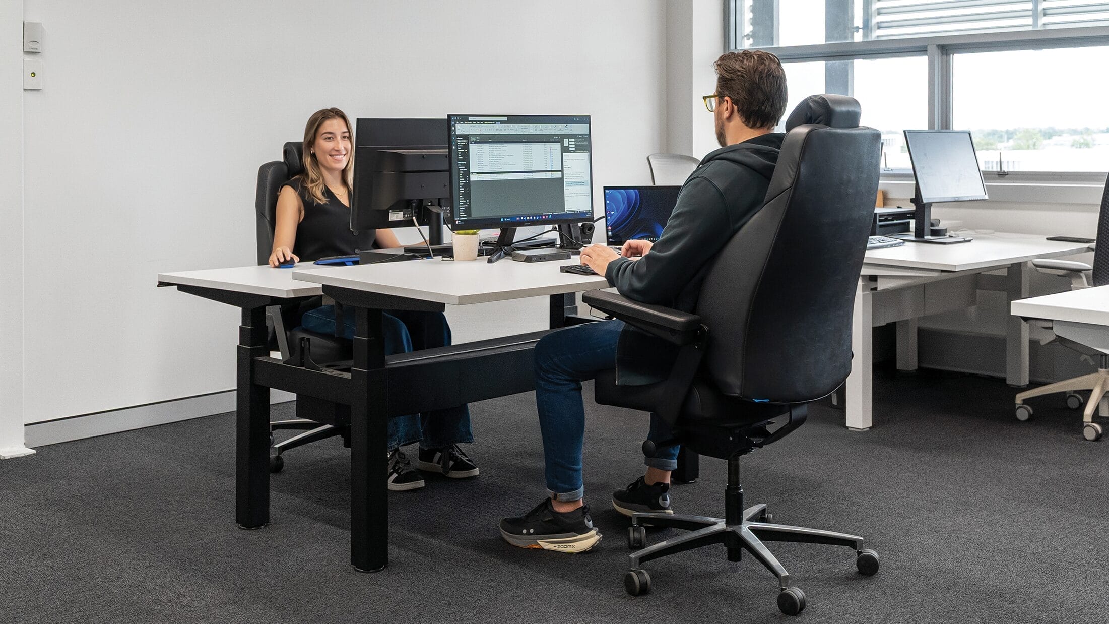
Most fit-out conversations start with walls, flooring, and lighting. Seating tends to come later, treated as a functional purchase once the bigger design decisions have been made. In practice, it's one of the most visually dominant elements in a room, and the one people are in direct physical contact with for hours at a time.
That changes how colour and texture work. A wall colour is seen. A chair's upholstery is seen, touched, and experienced over the course of a full workday. The weight of a fabric, the warmth of a finish, the visual presence of a bold colour; these aren't just aesthetic choices. They shape how a space feels to be in and how long people feel comfortable there.
Getting seating right from a colour and texture perspective isn't a secondary consideration. For most offices, it's where the design either comes together or falls apart.
How colour choices affect mood and focus
Colour psychology in office design is a well-worn topic, but most of the conversation focuses on walls and paint. Seating is rarely given the same level of attention.
Neutral and earth tones
Neutral and earth-toned seating grounds a space without competing with it. Warm whites, clay tones, and soft naturals create a sense of calm that supports focused work without feeling sterile, and they age well. The Konfurb Nara in clay or white sits naturally alongside timber, stone, and natural fabric finishes. For a deeper look at how neutral tones work in office interiors, Buro's guide to neutral colour palettes in office design covers the principles in detail.

Konfurb Nara in clay.
Accent and bold colour
A deliberate colour choice in seating signals intention in a way a neutral cannot. Forest green is a good example, considered and contemporary, it connects to nature without being literal and holds its presence without overwhelming a room. The Konfurb Nara's forest colourway works in exactly this way.

Konfurb Nara in forest.
Warm tones in PU and leather-effect finishes
Tan and warm caramel tones in PU upholstery add warmth that fabric chairs in the same shade rarely match. In meeting rooms or reception areas that could otherwise feel cold, a leather office chair in a warm finish shifts the atmosphere noticeably. The Buro Odyssey in Tan PU suits both casual meeting zones and client-facing spaces without feeling out of place in either.
The same effect can be achieved through custom upholstery. The Buro Mentor chairs specified for Majesty Mortgage and Insurance Advisors, with interiors designed by Urban Lounge Interiors, feature custom upholstered seats and backrests in Eastwood Tan fabric from Warwick. The upholstery brings a more residential feel to the workspace while maintaining advanced ergonomic support.

Buro Mentor - Upholstered chairs. Image credit urbanloungeinteriors.co.nz
What texture and material finish communicate
Colour gets most of the attention in office design conversations, but texture is often what separates a space that looks good from one that actually feels good to be in. The materials your seating is made from affect how a room reads visually, how comfortable people feel over time, and how the space holds up to daily use.
Fabric and mesh
Fabric upholstery brings warmth and a sense of care to a space. It softens the acoustics of a room slightly, adds visual texture, and signals that comfort was considered in the design process. Mesh has a different quality; it reads as more technical and ventilated, suits environments where movement and breathability matter, and tends to complement a cleaner, more minimal aesthetic. Neither is universally better. The right choice depends on the environment, the people using the space, and how long they're typically seated.
PU and leather-effect finishes
PU and leather-effect upholstery communicate something different again. The finish is sleeker and more uniform, which suits reception areas, meeting rooms, and client-facing spaces where a polished look matters. These materials are also easier to maintain in high-traffic areas, which is a practical consideration as much as a design one. In warmer tones, as covered above, they add a tactile richness that fabric doesn't always achieve in the same palette.

Buro Odyssey in Tan PU.
Matching seating to your space and zone
A practical way to approach colour and texture decisions is to think by zone rather than across an office as a whole. Different areas have different jobs to do, and the seating in each should reflect that.
Focused work zones
Calmer, more neutral tones support concentration. Seating that recedes visually, like warm whites, mid-greys, and natural fabrics, keeps the environment from becoming distracting rather than contributing to it. Fabric upholstery suits these spaces well, particularly where people are seated for longer stretches throughout the workday. The tactile quality of a well-chosen fabric also makes a difference to how a space feels after several hours in it.
Collaboration and breakout zones
Accent colour and soft seating earn their place in spaces designed for shared use. A bolder upholstery choice signals a shift in register, from individual focus to open exchange, and modular seating gives teams the flexibility to reconfigure a space without losing design coherence. Breakout zones benefit from a more considered approach to colour precisely because they're where people gather and where atmosphere is more actively felt.

The Konfurb Gem Ottomans custom upholstered in colourful fabric.
Client-facing and reception areas
Material finish carries the most weight here. A considered colour choice or warm PU upholstery communicates directly to someone encountering your organisation for the first time. Unlike internal zones where seating is experienced over time, reception seating forms an impression quickly, which makes the decision worth more thought than it typically gets.

The Konfurb Riva, from the Konfurb Project Series, is a heavy-duty visitor chair designed for durability and comfort. Available in a lead time of 10-14 weeks, it can be upholstered in our Konfurb fabric ranges.
Making seating work for your space
The colour and texture decisions you make in office seating are felt every day by the people working in your space. Buro's products cover a wide range of finishes, materials, and colourways to suit different environments.
For further reading on creating a well-designed workplace, the advanced office design hub is a good place to start.